The next set of blocks I am working on uses a complimentary color scheme of blues and oranges. I have been working with a house theme lately, and so decided to make a bunch of funky little houses. I have made about 20 houses so far, and have them up on my design wall trying to figure out how I want to put them together. All of these fabrics started off as white, and I have used several different dyeing techniques to get the patterns and colors you see here.
Sunday, April 27, 2014
Color Schemes
This weekend, I was invited to a friend's cabin in the Jemez Mountains for a girls sewing weekend! I spent a day and a half playing around with my hand dyed fabrics, starting a couple of quilts. The first one uses an analogous color scheme with reds, purples, blues, and a touch of green. I was playing around with triangle shapes in two different sizes. After the piece was put together, I decided it must be pines in the Jemez.
Fabric Collage
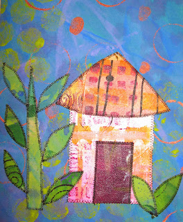
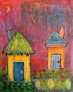
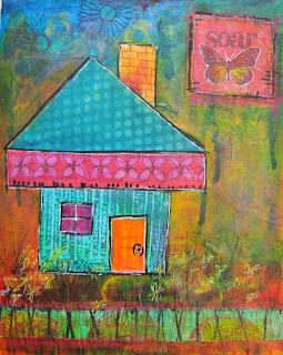
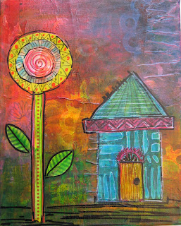
These are a few little experiments that I am working on with a fabric collage technique. I first start with raw canvas--sometimes I prime it with gesso, other times I just go right in with acrylic paint. I paint pieces of canvas about 18 x 22 inches, with layers and layers of acrylic paint. I use different techniques to add the layers--paint scraping, stamping, freehand mark making, stencils, splatters, etc. to create colorful and patterned pieces of fabric. Then I cut them up and applique them to a base fabric. All of the fabrics here were hand painted. I don't usually have a piece planned out completely, but have an initial idea of what shapes I will be using, and then I play around with the layout before I stitch them down. Here are 2 houses, and some flowers in progress.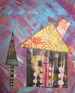


Black and White
The paper cutout project got me to thinking about contrast. I am used to working with contrast in quilting—many times patchwork patterns are relatively high contrast, so that the design can be seen. Recently, a couple of quilting friends and I were experimenting with Notan, which uses only black paper cut out and placed on a white background. We worked out some paper designs, but I think that some of these could be worked out as applique patterns, or perhaps stamps or stencils to create surface designs. Tessellations are another concept that I would like to play around with, with both paper and fabric.
Collage
I wasn’t new to the process of collage, but the class project was the first time that I have done collage with images that I did not create myself. And to further the challenge, only using images of the word that we were given, in my case, eyes. I found the process challenging, but enjoyable. The types of collage that I have done in the past are using papers that I have painted and stamped, and cutting or tearing them into shapes to create the collage. I further paint, draw, and collage on the canvas to create the picture. I like working in layers, and using recycled or handmade papers to make my collage. I also do a form of “fabric collage” which is basically the same concept, except for using fabric instead of paper. Sometimes I have a design plan in mind, other times I cut shapes at random and arrange them into a composition. (Add some quilting lines to them, and they are really fun!)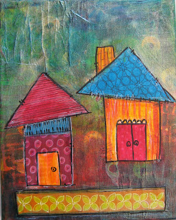


More on Line
Ah, continuing with my love for line. A couple of years ago, I took an online art class that included doing large doodles using a brush and india ink. At first, I was very reluctant to work large (say 18 x 24 inches), and I had never done much with a brush and ink. But, after doing one or two paintings, I found the process very freeing. I love using a brush to create large, gestural strokes. I love the way that a brush with ink creates an imperfect quality of line, unlike a pen, pencil, marker with all the same width of line. I could begin to control the brush to get wider lines, thinner lines, big expressive lines-- and not obsess about doing a “perfect”, tight, small drawing. I forced myself to work quickly, not think too much, and just keep my hand moving doodling, filling in the space of the page with line. I firmly believe that the more you do, the better you will become. I recently filmed this process and posted my first Youtube video. The video takes about 5 minutes to watch, but in real time took about 30 minutes to create. I really didn’t have a clear plan before I began the painting, but a vague idea of painting a vase with flowers, but each stroke I put on the page led to the next idea, and the next…
Line in Quilting
I love line. Line is my job. My job is to take a pieced or appliqued top, and sandwich the layers of top, batting, and backing together. Then I do machine quilting to hold the layers together, and to add a decorative element to the quilt. Some of the lines I add are for the purpose of utility, some of the lines I add are for decorative purposes. I have to make the decision of what type of line (straight or curvy?), the quantity of the line (dense or loose quilting?), what is the color of the line (to blend or contrast with the fabric, solid color or variegated, matte or metallic thread?) Are the quilting lines to be a focal design element, or blend into the background and let the pieced design be the star? I have quilted over 2,000 customer’s quilts, and probably a few hundred of my own. No two are the same. The design process starts over every time, and basically boils down to how am I going to use the line that my sewing machine creates to add a design element to a quilt?
Handwritting as Art
I enjoyed watching the PBS video with El Anatsui. One of the things that struck me was how when he was a little boy, before he could read, he was enthralled by lettering on buildings. Even though he couldn’t read, he liked the look of the letters, their lines and curves. He spoke of how interesting he found the letter “G”—something like a “C”, but more intricate. He spoke of how he would draw out the letters even though he didn’t know what they were. That interview struck home with me—I love looking at different written languages, Japanese, Chinese, Arabic, Russian, for their elements of linear design. I remember when my daughter was in 3rd grade, and learning how to write in cursive. Her homework each night was to write the same letters over and over again. aaaaa ccccc, etc. She got so bored with it, that suggested that she combine the letters in different patterns. After she did that for a bit, she says, “Mommy, this looks like your quilting designs”. True enough! Now, I use that as a teaching exercise when I am teaching free motion quilting, for people to start with designs they know, and what is more natural than writing. They make up different quilting patterns out of e’s or l’s or combinations of letters. I love to look at people’s handwriting—the loops and curves, the character of the line, that is unique for everyone. What is more unique than a signature? Our handwriting is an artistic expression of ourselves. The art of Calligraphy, the art of Graffiti, artistic Journaling….
Sunday, April 6, 2014
I Am For An Art
I used to compose haiku as I was trying to drift off to sleep--something to distract my mind from all of the stresses of the day, and to take my mind off of the endless "To Dos". Now, I have been finding myself composing "I am for an Art" statements instead. They are quirky and fun, and a great way to engage my mind to get to sleep.
I am for an art exploding with color like a rainbow on acid.
I am for an art that sticks with you like a piece of popcorn stuck in your teeth.
I am for an art that washes over you like a tsunami.
I am for an art that breaks through the clouds like the sun on a rainy day.
I am for an art that holds you with suspense and curiosity like a train wreck.
I am for an art that brings a breath of fresh air, like the scent of Glade in a stinky bathroom.
I am for an art that satisfies like a good scratch behind a cat's ear.
I am for an art that is as crazy as a lunatic who escapes from a mental asylum.
Tuesday, February 25, 2014
Playing with Shadows
Light and shadow were the theme for this project, and one of the readings, "Black Box: Between the Lens and the Eyepiece" by the artist William Kentridge, got me to thinking about how my kids play with shadows, and how fascinating shadows really are. In this article, Kentridge talks about "shadow puppets", crating a shadow on the wall using backlit hands. We have all done that--playing around with how to get your hands placed "just so" in order to make the shadow look like a dog, a bunny, or a bird--that is about the extent of my shadow puppet abilities! What Kentridge pointed out, was that we know that the shadow is not that of an actual animal, that it is an illusion created by our hands and the use of light and shadow, but that we tend to "recognize the pleasure that you derive from this self deception". That we cannot "stop the suspension of disbelief". I love that he was able to put that feeling into words. Just because I know that the shadows are not actual creatures, it is so much fun, and perhaps a personal challenge, to make them. I love being taken to a different place through imagination and suspension of disbelief whether it is a movie, book, etc. Throw three kids in the mix, and its a party! Their creativity in not only making the shadow puppets themselves, but suspending their disbelief and delighting in the shadows is such a joy to experience. All of my kids, the 2 younger boys aged 3 and 8 in particular, sleep with lights or flashlights at night. Sometimes it is used as a security blanket, to scare away unwanted shadows, other times it becomes a crazy lazer-beam light show, but often, they make shadow puppets on the wall, and make up little plays or stories to go along with the shadow characters they are creating, and have many minutes of entertainment and pleasure! To see that Kentridge can use "shadow puppets" in quite a more sophisticated manner, and with such underlying commentary about racial wars, violence, and history, but also with a sense of playfulness, is wonderful.
Tuesday, February 11, 2014
Darkness and Light
This is the self portrait photo that I am using for the project. Interesting what happens to the shapes and lines in the photo as it is reduced down to only black and white. I like the way the folds in my shirt made stripy lines--that was unexpected. We took the picture with a light from the side so as to cast shadows on one side of my face. The trick for the project was making all of the black shapes connect so that I will be able to cut the whole picture from one sheet of black paper. What has been fun for me so far, was coming up with the other imagery that is symbolic of my life. The kids, our pet rats, our house, zebra stripes, quilting blocks, etc. I have just about finished compiling the imagery and reduced them to black and white shapes--can post a pic of the layout next.
Tuesday, February 4, 2014
Installation--"Rock Art"
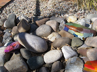
So, we had a fire drill during class a couple of weeks ago. We were lined up outside, on a path next to some xeriscaping. I had the installation project in the back of my mind--still hadn't decided what to do. While we were standing out there, I began to notice all of the interesting shapes, colors, textures, strata, etc. that made up the rocks. I began to think about how I could use that inspiration for my installation.....
I began the process by repainting a bazillion squares of color. The Bristol Board that we had been doing our mixing color samples would be too stiff to wrap around a rock. I used recycled packing paper, which was nice and thin and crinkly.
Next, I tore the painted squares into smaller shapes--mostly rectangles and squares. I learned how to tear paper on the correct grain so that I didn't end up with an unpainted edge along the torn edge--you learn something new every day!
Here is the view of my 5 "Art Rocks" as seen coming down the path. The orange rock seems to stand out the best, catching one's eye, and then hopefully the viewer will have a closer look to see what it is all about.
Can you see them now? Five rocks, one in neutral grays and browns, one in reddish browns and dusty greens, one in blues, one in pinks and purples, and the last one in orange. Had some technical difficulties along the way, but all in all, I am pleased with the outcome.
Tuesday, January 21, 2014
Mixing Colors
These are some of my color swatches that I am mixing to create the 48 color Color Wheel for class. We are mixing the primary, secondary and tertiary colors, to get a total of 12, then adding white to make 12 tints, adding black to make 12 shades, adding the compliment to create 12 neutrals. What strikes me about mixing paints vs. dyes (which I have done a lot of in the past), is that the measuring is much more precise in my dyeing methods, and easier to reproduce the results. I suppose if I were mixing larger quantities of paints, I could figure out some formulas much like I do with my dyes, but for making the color swatches for this class, that won't really work.
Above, is a page out of my Dye Notebook, where I keep track of my dye formulas and fabric swatches. A few years ago, I did the 12 step color wheel with dyes, plus 12 tints and 12 shades, but I haven't done fabric samples using the compliment--which would be a fun experiment to do. The next time I get the dyes stuff out, I will have to try it.
Monday, January 13, 2014
New Year, New Class, New Blog
After being out of school for almost 18 years, I have decided to go back to school to pursue an Art Degree! I am currently enrolled in Art Practices I at CNM, and this is a secondary blog that I will be using to post my class work. My previous blog, www.enchanted-art.blogspot.com has been sadly under used for the past couple of years due to life drama, but I am also hoping to be making updates to that blog as well.
It feels good to make art a more important focus on my life now, and I am enjoying the learning process in a classroom setting again. So far, we are focusing on mixing colors. Making a 12 step color wheel using acrylic paints, and then another 12 tints, 12 shades, and 12 with the complimentary of each of the original 12 colors. What has struck me so far, is the difference between mixing paints and mixing dyes for fabric dyeing (which I have done A LOT of over the past several years). When mixing dyes, I use a measured formula for each color--cups, tablespoons, teaspoons, etc. For mixing paints, it is more like adding a dab of this, and a drop of that.....Taking a little more time to get just the right mixture of the color to match the Master Color Wheel. But a great learning exercise. I will post pics soon of my progress thus far, but wanted to get the ball rolling with the blog today.
Subscribe to:
Posts (Atom)


.jpg)


